Today, I’m going to talk to you about coloring in the lines and not treating your books like kindergarten art projects.
After recent posts about publishing, self publishing and the direction I think the future should go in – I was starting to look for other topics to talk about. But as I was looking at my long To-Do list I realized that there were still things I needed to do that I’ve seen a lot of indies mess up. In fact, I’ve messed them up here or there myself. So if anyone’s going to tell you this message, it should be one of your own:
You can’t do everything on your own unless you learn what you’re doing first.
Now this isn’t to say that you have to shell out a lot of cash to someone for everything you don’t know how to do. In fact, for most things that you’re not 100% certain on, you can probably learn how to do it. But there’s some things that you just cannot, under any circumstance, allow your inability to louse up. Specifically, for the purposes of this post: don’t fuck up your cover.
I know that the saying has long been “You can’t judge a book by its cover”. But even if it’s true, it’s irrelevant because you do. Everyone judges a book by their cover and everyone has seen instances where a good cover can immediately draw your attention. You see, the cover is your first piece of advertising. Before they know who you are, before they know your work, they’re going to know your cover. The cover is like a billboard for the shelves or the websites while shoppers pass by. If you have a good cover they’re going to stop to look. And, while they will stop for a bad cover, the bad covers are usually laughed at, not flipped through.
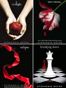
Marketing is one of the hardest aspects of selling books and the cover is the first introduction most people have to your work. Even in an ad you’ll usually include a picture of the cover, so it makes sense you would want it to be striking and instantly recognizable. As much as it pains me to say this, one of the best sets of covers I have ever seen belongs to… Twilight.
Love them or hate them, the books or the covers, you immediately know what they are from a distance. They’re recognizable no matter how far away you’re seeing them, so long as you’re able to discern the shapes and colors. They’re simple, elegant and have carefully chosen colors and fonts. The titles are almost invisible from a distance yet you’ll immediately know what they are. For all that can be said about these books, good or bad, you cannot deny the fact the covers are solid.
But one of the major problems with making independent novels catch on is that there are some horrible covers out there. I understand – not everyone is a graphic designer and paying the professionals can be costly from time to time. Honestly, I can’t tell you I know absolutely how to do it right. But what I can do is show you things I’ve seen that I know for a fact are wrong.
So, as just something of an experiment, let’s create the cover of a generic vampire novel based on mistakes I have seen in the past. I could provide examples of everything I’m about to show you, but showing those would just be cruel to people who I know probably gave it their best. Just keep it in mind as I do this: no matter how ridiculous it may seem, I have seen it happen before.
So let’s get started on fucking up a cover, shall we?
This cover really says nothing about the book except the title. You may have seen some books with just the title and the author’s name (and, by the way, you forgot your name), but those were classics. Classics don’t need to market themselves anymore, their name is enough to make someone jump for them. Note, many of those can be leather bound or have metallic colored inlay… they are definitely not fighting for recognition anymore.
Really, this isn’t the point to panic, you’re just figuring the location of the title and really haven’t done anything else yet. From here you need to consider the theme of the book and get ideas on ways you can convey something about the book to the reader. Maybe there’s an object in the book of importance or a metaphor you can reach across. Find an image that fits in some way and then figure out what fonts will fit to the theme. Oh, and remember to put your name in too.
Holy crap, there’s nothing on there, I need any picture and fast. It has vampire in the title so I should put a vampire on. Maybe a sexy one. No, wait, sexy vampires are too common now, so I should probably get something that’s different so that people don’t think I’m ripping off the popular books. Oh, and red for blood because vampires and blood are connected. Yeah, I’m going to do that.
There’s a couple of things wrong with this one, actually. First, remembering that this is going to be viewed either as a thumbnail or on a shelf, no one’s going to actually be able to see what this is saying or what that picture is from a distance. Go ahead, back up from your screen until this picture is about the size of a thumbnail. Can you tell what it is anymore? The answer for most people is no, and the ones who do recognize it either have especially good vision or are just unable to forget what they saw in the first place. In fact, do the same with the Twilight covers earlier. Crazy, isn’t it?
Second, when people do get a good look at it, your failed attempt to crop that picture from a larger photo is a clear sign that you are an amateur that either A) couldn’t get picked up by a publisher or B) has sold so few books that you couldn’t afford help. Neither one of these speaks well of your skills.
Still going to say this is time to back up and find your theme. The red and black color scheme can and has worked on covers before, you could probably find an angle on it related to your plot. Maybe you inverse the colors so that the black font stands out against a red background. You could even put a crest, silhouette or abstract image there in black too. Possibly you could add a third color in there for some extra contrast. Oh, and you still forgot your name.
Ugh, the vampire in that picture is uglier than I thought it would be. It wont tell people what the story is about at all. I know, I’ll tell them what it’s about on the cover so they wont have to guess. And I need to put my name on it, I want them to know who wrote this, like how the professional author’s names are the easiest part to read!
Okay, this gives you a better idea of what the story is about. It has all of the same visual problems that the last one had with the picture in the center but no one is going to look at it and mistake it for what it is. Problem, however, is that they’re still going to have to read the cover to know this and the first impression is, invariably, going to be the picture still. Oh, except for your name. They’re going to know who to blame for that cropped picture in the center by name, for sure.
The text parts of this are… acceptable. You’re not really helping anything but you’re not really hurting them either. The size of your name isn’t really going to do as much for you as you’d hope since the people who tend to do that are the people who sell books on name recognition alone and, if you had that kind of recognition, you wouldn’t be making this cover yourself. Some people may tell you that you can trick people into thinking that you’re a big name if you have a big name on the cover, but no one’s going to be fooled if the picture in the center is still crappy.
My name is taking up so much space that people are definitely going to see it now! And I’ve explained that it’s a love story now so there’s no chance they’ll miss it. But now the title looks too plain. Maybe I should change the font. Oh, hey, I’ll just decorate that part!
Same problems, new version, though the “blood” effect could almost be argued for on a better cover. It even frames the “subtitle” nicely if you look at it long enough.
Okay, let’s ignore the font for a bit and consider the theme again. You’re saying this is a love story but you’ve got a clearly ugly thing in the center. Maybe that’s on purpose, like Cyrano de Bergerac with vampires. But, frankly, if this is Cyrano de Bergerac I still have no way of knowing this. All I know is that there’s a badly cropped picture in the center and your font changes aren’t distracting me from that. Also, there’s officially no connection between the fonts… at all.
This is still ugly, I don’t understand. Maybe it just needs some color!
Finding that the cover lacks in aesthetics, the typical amateur designer throws in colors to try to fix it. More often than not, people who are going down this road end up stopping right on this step and deciding this is the point where they’ll publish. From a distance you can’t really see the fonts, in fact, even up close you may sometimes struggle with it. The two images don’t match at all and it’s hard to tell if there’s any theme here except vampires and lovers…though…lovers at sunset…congratulations because…
Oh my god, you found a theme! You’ve actually done it. Lovers at sunset, while kind of a twilight reference, could totally be what you’re looking to convey here. Just one problem, not only have you not gotten rid of that damn cropped picture but he’s now looking like a 9 foot tall creature of the night getting ready to eat those people mid coitus while they quietly tell each other to stop biting so hard.
He’s standing out way too much, you have to fix it.
Seriously? I’ve seen covers that look like all of the above (and, usually when they make these mistakes, much worse). I’m not saying that they have to be perfect, and with a few tweaks you can make even my attempts above look decent. But in the end you’re going to reveal your status as an amateur if you start off with a bad base and then continue to try to gloss over it. If you’re someone who has a cover with similar problems to the ones above, you need to step back and figure out what exactly you’re doing. Not only that, but if you don’t have the skills to do better without spending money – it’s time to spend money.
I know, that concept sucks, but sometimes you have to do it. After all, for certain jobs…
Enthusiasm doesn’t always make up for experience.
Speaking of covers and indies, I’m one of the silly folks that designed my own cover. I’m aware it’s not the greatest, but I’d like to think I didn’t commit any of the sins above and that it’s recognizable from a distance. And, hey, if you want to avoid judging my book by my cover, go ahead and buy it. And I think the cover for my second looks a lot better.


